Indicators of SpLD Series
by Jan Thomson-Long
Standardised Scores
“Avoid the top of the bell curve, everyone there is mean”. ~ Unknown
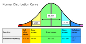
So the bell curve is defined as a graph of a normal (Gaussian) distribution, with a large rounded peak tapering away at each end. A cousin of Charles Darwin, Francis Galton envisioned a measure to quantify normal variation which forms the core of statistical analysis. This is known as the normal distribution curve, or fondly referred to as the bell curve given it’s bell shape and is the most common distribution for randomly generated variables throughout nature.
This bell curve is used to identify variance from the mean which is the peak of the curve. When 100 is the peak, one standard deviation below is 85, and one above is 115. These are used to identify those who are outside of the ‘average’.
Within the realms of diagnostic assessment the scores give us useful information. However, we don’t only look at the scores in making a diagnosis. Everybody is an individual and scores on one particular day cannot tell us that person’s story.
In reading a report be aware that the explanations around the testing are essential to interpreting the findings. As assessors although we report the individual test scores most will also have confidence intervals which are a range where you expect the true score to fall between if the test was redone, within a certain level of confidence (in the UK we used 95% confidence interval).


